Realistic Font: A Web Designer’s Layout Test
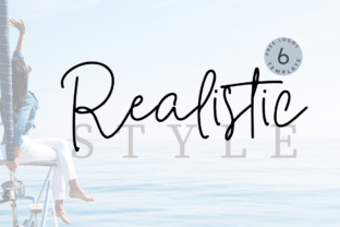
I was staring at a hero section for a new creative coaching website, and something felt off. The layout was clean, the photography was warm and inviting, but the headline lacked personality. It looked like every other minimalist template on the market. I needed a typeface that could bridge the gap between professional authority and human connection without sacrificing readability on mobile devices. That is when I decided to test Realistic, a display font from Script Amp that promised high-impact headlines with a playful, carefully crafted edge.
As web designers and digital product creators, we know that choosing a premium font is never just about aesthetics. It is about user experience, brand trust, and conversion. When I dropped Realistic into my Figma file, I wasn't just looking for a pretty script; I was testing how it would perform in a real responsive environment. Here is what happened when I integrated this modern typography choice into a live project workflow.
First Impressions in the Hero Section
The first test for any display font is the hero banner. This is where you have seconds to capture attention and communicate value. Realistic immediately stood out because of its unique construction. Unlike many script fonts that prioritize elaborate swashes over legibility, Realistic feels grounded. Each letter has been created to maintain a playful rhythm while remaining distinct enough to be scanned quickly.
I used it for the primary H1 tag: "Design Your Life With Intention." On a 1920px desktop screen, the font sang. The weight was substantial enough to hold its own against a busy background image, yet the open counters prevented it from feeling heavy or cluttered. It struck a balance that is often hard to find in creative fonts—it felt handmade but not messy, fashionable but not fleeting. For a coaching brand, this visual tone established immediate warmth and approachability, which are critical metrics for user engagement in this niche.
Testing Readability Across Breakpoints
The true challenge began when I resized the artboard to mobile. We have all been there: a beautiful desktop headline turns into an illegible scribble on an iPhone SE. My UX-aware approach required me to be ruthless. If users have to squint or zoom, the font fails.
Realistic performed surprisingly well in responsive layouts, but it required intentional handling. At smaller sizes, the intricate details naturally compress. I found that keeping the text size above 32px on mobile viewports maintained perfect clarity. Below that threshold, I switched to a secondary typeface. This is a crucial lesson for landing page designers: Realistic is a specialist, not a generalist. It excels as a headline or accent font, but it should never be forced into body copy duties. By respecting its intended use case, I preserved both the aesthetic appeal and the accessibility standards required for modern web design.
Strategic Font Pairing for Digital Hierarchy
A standalone display font rarely builds a complete brand identity. To make Realistic work within a cohesive digital ecosystem, I had to pair it thoughtfully. Because Realistic carries so much character and visual weight, it demands a supporting actor that knows how to stay quiet.
I opted for a geometric sans serif font for the subheadings and navigation, and a highly readable serif font for the long-form blog content. This combination created a clear visual hierarchy:
- Realistic (Display): Used exclusively for H1s, pull quotes, and promotional banners to drive emotional connection.
- Geometric Sans Serif: Used for UI elements, buttons, and captions to ensure functional clarity and fast scanning.
- Editorial Serif: Used for article text to reduce eye strain during extended reading sessions.
This trio worked seamlessly together. The contrast between the playful curves of Realistic and the structured lines of the sans serif created a dynamic tension that kept the page visually interesting. For online store owners or course creators, this kind of typographic system signals professionalism. It tells the user that the brand is creative yet organized, which directly influences perceived trustworthiness.
Application Beyond the Homepage
Once the hero section was validated, I explored how Realistic could elevate other touchpoints in the user journey. Consistency is key to building a memorable online brand experience, but repetition can lead to fatigue. I used Realistic strategically to mark transitions and highlight key moments.
On the sales page, I utilized the font for benefit statements and testimonial highlights. Instead of using bold or italic styling on standard body text, switching to Realistic for phrases like "Join 500+ Happy Students" created a pattern interrupt. It drew the eye naturally down the page, guiding the scanning behavior toward conversion points. In the email marketing templates, I used it sparingly in headers to maintain brand recognition without compromising deliverability or load times. For social media graphics and digital ads, the font proved incredibly versatile, maintaining its impact even when cropped into square or vertical formats.
Technical Considerations for Web Implementation
Before committing to Realistic for a client project or your own digital brand kit, there are practical technical factors to verify. As a product from Script Amp, checking the specific licensing is non-negotiable. Ensure your license covers web embedding, especially if you are designing for commercial clients, SaaS platforms, or e-commerce stores. Desktop licenses do not always include webfont usage rights.
You should also inspect the included file formats. For optimal performance and cross-browser compatibility, WOFF2 is the gold standard. Check if the font family includes multiple weights or stylistic alternates. Having access to alternate characters can be a lifesaver when you need to avoid awkward letter collisions in specific headline combinations. Additionally, verify multilingual support if your website serves a global audience. Nothing breaks immersion faster than a beautiful custom font reverting to Times New Roman because it lacks an accented character.
Elevating the User Experience Through Type
Incorporating Realistic into this project reminded me that typography is one of the most powerful tools we have for shaping user perception. It is not merely decoration; it is interface. When used correctly, a fashionable font like Realistic does more than look good—it communicates mood, establishes hierarchy, and guides interaction.
For web designers and entrepreneurs looking to differentiate their digital presence, this typeface offers a compelling solution. It provides the human touch that generic system fonts lack, while maintaining enough structural integrity to function in a rigorous UX environment. Whether you are redesigning a portfolio, launching a boutique online store, or refreshing a campaign landing page, Realistic brings a level of polish that elevates the entire brand experience. Just remember to let it shine in the spotlight of your headlines, and support it with reliable, readable partners for the rest of the journey. The result is a website that feels both intentionally designed and authentically human.